


The rug should connect the room, not necessarily match all its colors
To pair a rug with your decor, first decide what role it should play in the room: calming an already busy space, providing the main pattern, warming up a neutral palette, or connecting several existing colors. Then, pick up one or two hues from the rug elsewhere in the room, without aiming to perfectly match the sofa, curtains, cushions, and walls.
A decor appears cohesive when elements share some commonalities — color, material, style, or proportion — while still maintaining differences. The rug can thus be similar to the sofa, contrast with it, or serve as a "bridge" between several elements. Here's a simple method to avoid both the catalog effect and the patchwork effect.
1. Start by deciding if the rug should calm or energize the room
Look at what's already dominant. A colorful sofa, printed curtains, and several paintings already create a lot of visual information: a plain or subtly textured rug can then stabilize the overall look. Conversely, a room composed of white walls, a beige sofa, and wooden furniture can accommodate a more graphic rug.
This decision simplifies all subsequent ones. Many interiors become cluttered because each element tries to be the focal point: a very graphic rug, an intense sofa, large patterned curtains, and a decorative wall all at the same time.
2. How to choose rug colors in relation to the rest of the room?
You don't need to find the "exact same beige" or "exact same blue." Variations in tone often add more depth. Instead, work with a coherent family: sand beige + ecru + light brown, grey-blue + petrol blue + warm wood, or sage green + olive + cream.
If the rug has multiple colors, choose a dominant one and a secondary one. You can then echo the secondary color in two small elements — a cushion, a throw, a vase — to make the rug feel like a natural part of the room.
Contrast is just as valid. A deep blue rug under a beige sofa can be more interesting than a nearly identical beige rug. Similarly, a terracotta rug can warm up a grey living room without that color appearing everywhere else.
3. Rug and sofa: should they match?
No. The sofa and rug occupy two large, adjacent surfaces; if they have exactly the same color and similar texture, they can blend into a single block. A slight difference in value, temperature, or material usually creates more depth.
With a neutral sofa, the rug can express personality: vintage, geometric pattern, deep color, or natural texture. With an already very colorful sofa, a calmer rug can pick up a secondary shade or stick to neutral tones.
Also consider the shape. A very rectilinear sofa can be softened by a round or organic rug if space allows. A corner sofa primarily requires a rug large enough to connect the two sections of the furniture.
For placement, use our guide how to place a rug in a living room rather than reducing the question to color.
4. Should the curtains match the rug's color?
Not necessarily. Curtains and rugs frame two different areas of the room. Making them identical can create a very coordinated effect, but also a rigid result if the pattern is strong.
A more flexible method is to share a color family. Ecru curtains can go with a beige and blue rug; sage green curtains can converse with a small green touch in the rug without repeating the pattern.
Material also creates a link: a textured rug and linen curtains work well in a natural ambiance, while a graphic rug and smooth curtains avoid pattern competition.
Light greatly alters vertical textiles. Check curtains and the rug in the room, both day and evening, rather than just comparing two product photos.
5. Use cushions, throws, and small objects as links — not as miniature copies
Small accessories are the simplest way to connect the rug to the rest of the decor. If your rug contains blue, a single blue cushion or a poster with a similar touch can be enough. There's no need to repeat every shade.
Vary the materials: velvet cushion with short-pile rug, wool throw with flat-weave rug, or linen cushions with a natural rug. This variation prevents a coordinated ensemble from becoming monotonous.
However, avoid "correcting" a bad rug choice by adding ten matching accessories. If the rug seems completely alien to the room, first review the palette or the main contrast.
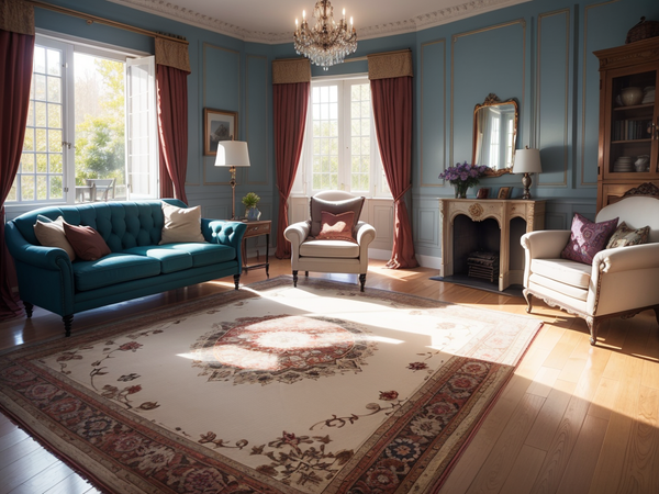
6. How to mix rug, curtain, and cushion patterns without overwhelming?
Choose a main pattern. If it's on the rug, the curtains can remain plain or use a discreet texture. Cushions can pick up a smaller, secondary pattern.
When mixing two patterns, vary their scale. Large organic shapes on the rug can work with thin stripes on a cushion. Two large patterns of the same contrast placed side-by-side will compete more.
Also maintain a common palette. Different patterns appear more cohesive when they use two or three similar colors. Conversely, an additional pattern in a new palette gives the impression that a new decorative universe is arriving in the room.
7. Texture: the simplest way to add depth without adding color
In a neutral decor, textures prevent the overall look from becoming flat. A looped rug, a smooth fabric sofa, linen curtains, and a wooden table can create a lot of richness with a very limited palette.
Conversely, if the room already contains several strong materials — velvet, shiny metal, veined wood, stone — a highly textured rug can become unnecessary additional information. A calmer weave then rebalances the whole.
Texture should also match the use. A very soft shaggy rug is coherent in a bedroom or a quiet living room, less so under a dining table where chairs and crumbs make cleaning more complex.
8. Light changes the color of the rug more than you imagine
A shade can appear warm under a light bulb and greyer in natural light. Before choosing, observe samples or photos in the room at different times of day.
Light coming from a window also creates brighter areas on velvets. A pile rug can appear lighter on one side and darker on the other depending on the angle. This is not always a difference in dye.
For artificial lighting, use multiple sources adapted to the room's uses rather than trying to "highlight the rug" with a dedicated spotlight. The entire living room should remain comfortable.
9. Good harmony doesn't compensate for a poorly sized rug
A rug perfectly matched in color can still look strange if it's too small. In a living room, the rug should generally connect the sofa, armchairs, and coffee table. In a dining room, it should allow chairs to remain on it when they are pulled back.
| Room | Rug's role | Common mistake |
|---|---|---|
| Living Room | Gather seating | Small rug isolated only under the coffee table |
| Bedroom | Create a comfortable zone around the bed | Rug almost entirely hidden under the bed |
| Dining Room | Delimit the table and accommodate chairs | Rug from which chairs move off with every movement |
| Entryway | Structure the passage without blocking the door | Thickness or format incompatible with door opening |
Size creates structure; color comes next. For a living room, measure the furniture group before choosing the pattern.
10. Some consistent style associations
Natural / Japandi: light wood, linen, matte ceramics, and ecru or natural fiber rug. Depth comes more from materials than patterns.
Contemporary: simple sofa, clean lines, geometric or colorful rug as a focal point, limited accessories.
Vintage: antique-lined or second-hand furniture, rug with a distressed effect, plain curtains, and warm materials like wood or brass.
Bohemian: more colors and textiles, but a common palette remains useful. A strong patterned rug can be accompanied by varied cushions without all prints having the same scale.
Style labels primarily serve to guide your choices. A personal room can mix several influences as long as common elements are maintained.
11. Mistakes that make a room less cohesive
- Exactly matching all colors: variations in hue add more depth.
- Making every element a focal point: choose a hierarchy.
- Multiplying large patterns: vary their scale or keep some textiles plain.
- Ignoring rug size: proportions structure the room more than color.
- Adding too many visual links: two color accents are often enough.
- Choosing only on screen: real light and neighboring materials alter the rendering.
- Neglecting use: a rug should be beautiful but also compatible with traffic, furniture, and maintenance.
FAQ: pairing a rug with your decor
Should the rug be the same color as the sofa?
No. It can be lighter, darker, contrasting, or contain a secondary color from the sofa. The important thing is that the two large surfaces remain visually clear together.
Can you mix several patterns?
Yes. Choose a main pattern, vary the scale of the others, and maintain a common palette to avoid an overwhelmed look.
Should rugs and curtains match?
Not exactly. A color family, similar material, or a small common shade is enough to create a link.
How to integrate a very colorful rug?
Keep large adjacent surfaces calmer and echo one or two colors from the rug in small accessories.
What if the rug seems too prominent?
Reduce other strong patterns and colors before changing the rug. If it remains disproportionate, also check its size and its contrast with the floor.
In a living room, good pairing starts with proportions. First choose a format that connects the furniture, then work on the palette.
Discover living room rugsTo pair a rug with your decor, finally remember three ideas: give it a clear role, create a few accents rather than a perfect match, and always check the proportions. A cohesive room is not a room where everything looks alike; it's a room where colors, materials, and volumes seem to have been chosen to work together.